You probably know more and more people are consuming web content over their mobile devices. That content includes your websites. But did you know such content will soon be prioritised by Google if it is particularly mobile-friendly, in particular if it is housed in a responsive design?
In a month, Google is rumoured to be changing its algorithm to favour responsive sites. Some frame it as punishing non-responsive sites. It’s the same thing.
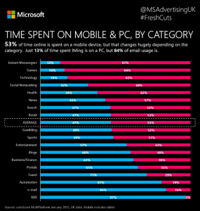
There are three big points to this. The first is that the mobile market is big and accelerating. Half of all web pages served up in the UK are now consumed over smartphones and tablets, often from static places such as offices or sofas, but still, the devices aren’t traditional desktops.
The second is that Google continues to dominate the search world with those trailing in the wake following their lead verbatim. In the UK, Google holds 88 per cent of the search market as of February 2015.
That means we should all pay close attention to what the search giant is up to. Search-related services such as Moz.com (previously SEOmoz) and Raven Tools are keenly followed. People hang on every syllable of Google search exec Matt Cutts – and try to second guess his team’s motivations and actions. That’s just the way it is.
My third and final point in the face of the first two is that, if you haven’t already, it’s time to respond to responsive. We have recommended and specified responsive digital solutions for over three years now as it is user experience best practice. With Google exerting its influence, again your website is in danger of losing half its traffic in the next four months. That’s a dramatic statement but if Google downgrades your non-responsive website by enough to drop it off the first page of search results then that effectively makes your site invisible to 90 per cent of would-be visitors.
Depending on the industry sector you are in, responsive might even be essential rather than a nice-to-have. Take those working in property. Large blocks of work take place outside of traditional offices, on site or on the move. Shouldn’t services those workers need be readily usable on any device?
There is more than one way to make your websites responsive. There’s a custom design approach that most large companies will favour. There is also an off-the-shelf template-based approach that relies on customisation. (How this site was made.)
Is it time you made sure that people who are on your site not only find their way around but get to you in the first place? Is this something you should be talking to your clients about?
How can I tell if my site is responsively designed?
Handily Google offers a mobile-friendly test for this – punch in your sites URL and Google will tell you what it thinks.
https://www.google.co.uk/webmasters/tools/mobile-friendly/
Google’s algorithm looks set to take place on 21 April 2015…

Leave a Reply